
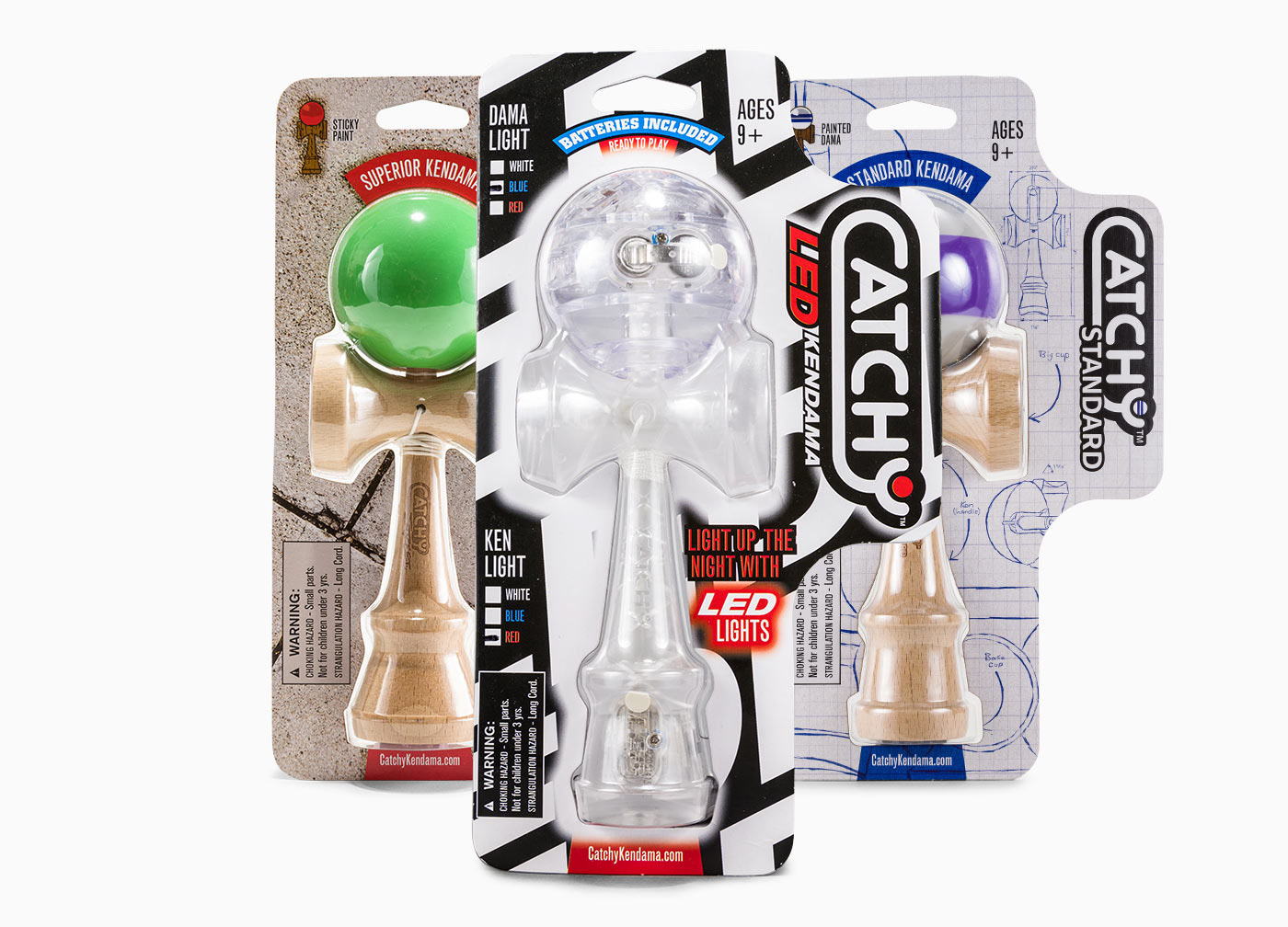
The kendama is a traditional Japanese toy that has gained a lot of traction in the toy industry lately. Kendamas are usually wooden and low-tech by nature, but Catchy Kendama wanted their first release to be the first of its kind.
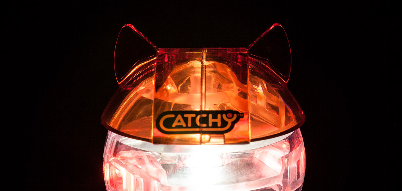
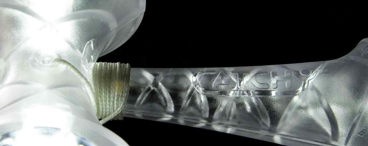
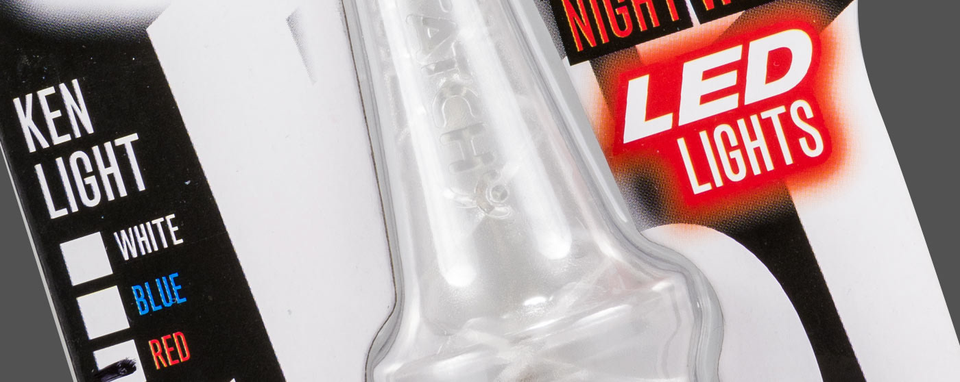
Sporting LED lights inside a translucent plastic housing, the new product needed a look that would appeal to new kendama players and capture the interest of the toy’s existing fan base. The ‘Catchy LED’ branding and packaging was designed to be eye catching and represent the products light-up feature.

After the success of the original plastic LED model, the ‘Catchy Standard’ and ‘Catchy Street’ were added to the line.


For the ‘Catchy Street’, I took to the city streets to capture some urban imagery that would give us the raw look I was searching for. Coming back with a range of textures we landed on a road texture for the final background of the packaging.


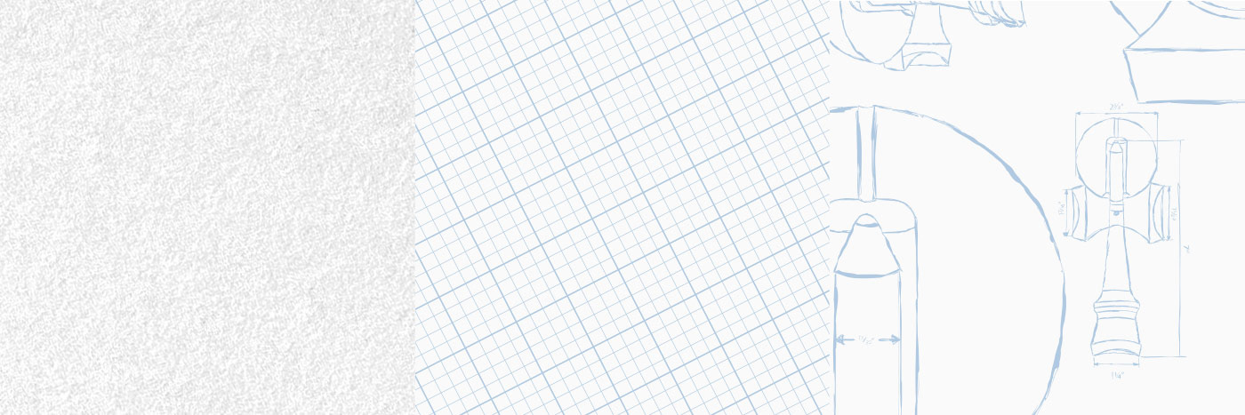
Taking an illustrative approach for the ‘Catchy Standard’, I developed a blueprint style look and background texture that still has a bit of a hand done edge to it.
The background is a mix of one of a kind, penned tracings of CAD drawings, and a simple grid over a unique paper texture.
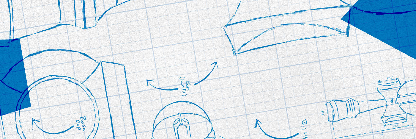
I brought the client’s original main brand “Catchy” to life. Using the die-line started by my client, I created a set of packaging and branding to form a cohesive product line that has individual visual themes, but are tied in by the consistent graphic elements, feature callout placement and package die-lines.